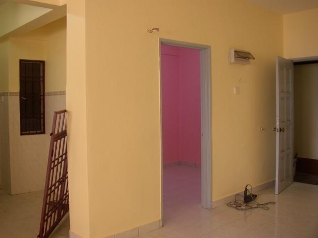
I was high in spirits when i went to my condo this morning. Arrived at the car park, saw the contractors unloading the grilles. Hurrah! They are finally fixing it. Went up to the 9th floor, took a peek through my study room window. My heart plummeted for a moment. I thought I chose pinwheel pink? Well maybe it's the tinted windows that made it look darker, I thought. Never mind, I thought..let's go have a look inside. As I opened the front door my jaw dropped. Choked. Asphyxiated. Nearly fainted. Almost died. Bright fluorescent pink!!!!NO!!!! IT CAN'T BE!!! It was a horrible Chinese New Year envelope colour, or perhaps Barbie pink. I don't even know how to describe it! What an eyesore. The colour looked entirely different in the chart. Check out pinwheel pink at
www.glidden.com under "Color palette" selection. You see it? But here's how my room ended up:


The popcorn white which I chose was also darker than expected. But acceptable as it was a smooth creamy colour.Can you see how the pink glows?!? You can see the fluorescent light deflect off the pink walls and onto the floor. Even the blue door ended up looking purple. The top picture is not really reflective of how bright the pink is. The second picture is. And it made the popcorn white look yellow.
Uncle Wong is bringing me to the paint shop tomorrow to ensure they have the right mix this time. Keeping my fingers crossed (not that I believe in it anyway...it's just a figure of speech..)
Moral of the story: choose the lightest shade of paint on the colour chart because the actual paint is going to be 500 times brighter.


1 comment:
Okay, point taken about the colour scheme. I read that they say the only way to test the colour is by buying a small can and painting a small section of your wall. Only problem is I rarely see small cans of paint in Malaysia!
Post a Comment